Galleries and Exhibitions · Uncategorized

Stanley Kubrick Archive

Until I watched the video Stanley Kubrick’s Boxes, and visited the London School of Communication, I had no idea that Stanley Kubrick was so obsessive in his work. I was aware he had directed Clockwork Orange, 2001 Space Odyssey and The Shining, but that was as far as my knowledge went.

First of all, watching the previsit video, I learnt that Stanley Kubrick had an obsessive attention to detail. He would send people off with a detailed brief to photograph particular areas and themes for his films.  For example, his nephew Manuel Harlan, had been sent off to photograph various themes in preparation for Eyes Wide Shut, and he estimated he took some 30,000 photographs. He confirmed that Kubrick actually looked at every image. On one occasion Kubrick asked his nephew to photograph a whole street, but because he didn’t want any tilt on the buildings, Harlan had to carry a 12’ step ladder from which to take the photographs, and to keep on moving it along the street as he progressed. The photographs were then taped together to form one long image.

This was just one example of the detail that Kubrick asked of his assistants in order to create a film. He had such an eye for detail that on one occasion and model had been built of a New York street. Kubrick took one look at it, and said the dimensions were incorrect. The assistant disagreed, but was sent back to New York to remeasure the buildings. As Kubrick suspected the measurements of the model were out, by a very small amount, and this mattered to him.

Watching the video, I could see that Kubrick’s obsessive nature meant that he accumulated boxes and boxes of material. Nothing was ever thrown away, and everything was carefully catalogued. Finally, a few years after Kubrick’s death, the family decided to donate all the material to the London College of the Arts, and it is now housed in a specially built archive at the London College of Communication.

I felt it was a privilege to be allowed to see just a small amount of material from the Kubrick archives. To actually see and touch original scripts, annotated by Kubrick, and to go through the photographs, all carefully labelled and stored in an index box was fascinating. The enlarged image of all the extras in a scene from Spartacus, each one holding up a number, thus enabling Kubrick to instruct each one exactly how to pose for the scene, showed once again his obsession for detail and perfection.

Sadly, the Kubrick family had requested that no photographs should be taken of any of the items on display, but nevertheless, it was a very memorable experience, and viewing those items has kindled an interest in his career and films which I never had before the visit.

Part 2 · Uncategorized

W Eugene Smith and Bryony Campbell

These two sets of photographs and stories show that the context of a photographic story can be very different from another.

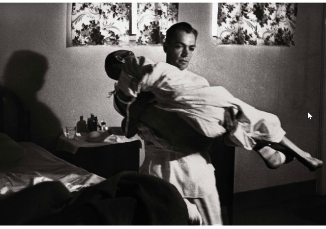
W Eugene Smith set out to document the life of the American GP Dr Ceriani for LIFE Magazine, entitled the “Country Doctor”. The process took 23 days to complete. W Eugene Smith spent some time initially with no film in his camera in order to get Dr Ceriani and his patients used to the camera’s presence.  The photographs document the day to day life of a GP, and whilst they are intended to be objective, there is also some empathy between the doctor and photographer.  For example the photograph of Dr Ceriani carrying an old man from the ward to the operating theatre shows that he is a caring doctor who will do as much as he can for his patients.


2020-02-12_16-16-03
Dr Ceriani carrying a patient from the ward to the operating theatre. © W Eugene Smith, Time Life Images/Getty Images


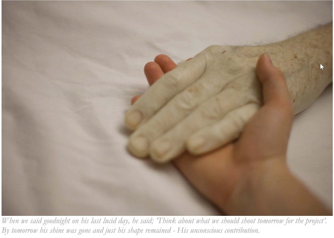
Bryony Campbell, in her Dad Project, set out to document the illness and subsequent death of her father.  In the process of doing this, she explored the relationship with her father, and of her relationship with her mother during this period.  The project was very personal, and on occasions she questioned whether she should be recording specific scenes.

2020-02-12_16-32-02
© Bryony Campbell

Her initial intention was for the project to be personal, not intended for others to see it, but after a while, she created  photo book, and exhibited the images.  The project was also published in various magazines and newspapers.  This, it turned out, was part of the healing process for Campbell.

Two photographic stories, but each with different purposes, and outcomes. W Eugene Smith’s story took just 23 days to complete, an objective story of a rural GP in America, but Bryony, on the other hand, because of the nature of the subject matter, would have had no idea how long she would be working on the project.  I was moved by the text linked to Campbell’s images, her thoughts and anxieties laid bare.

Campbell’s words: this is a story of an ending without an ending, seem to me to that although her father’s life has ended, he will never be forgotten because she made this photo story.  He will continue to live on in peoples minds as long as the photographs exist.

Reflections · Uncategorized

Hyperfocal Distance and Zoning

One of the points raised by my tutor relating the first assignment was hyperfocal distance.  I had struggled with this concept since first hearing the term, and admitted this to my tutor.  He sent me a You tube link which helped.  He explained that the confusion can arise because older lenses had measurements marked on them, but this no longer the case with most modern lenses.  None of my lenses has this information, but the YouTube clip helped me understand.  I then explored other YouTube clips, and all began to become clear.

The hyperfocal distance is the point at which, when focussed on, both the near-to objects and those at infinity will be “acceptably” sharp.

The importance of knowing the hyperfocal distance became clear in the context of landscape photography where the near to subjects need to be as sharp as the subjects at infinity.  The actual hyperfocal distance will differ according to the lens length and aperture setting.  I now have an app on my phone so that if I am photographing a scene which requires total sharpness, I don’t have to work it out manually.

This investigation led me to another similar concept: zoning.  Street photographers use this technique to avoid having to keep refocussing and risk losing an opportunity.  A street photographer will decide the minimum and maximum distances between which he needs to focus on his subjects.  This is the “zone”.  The focus will then be preset manually on the camera to be one third within the zone so that the photographer doesn’t need to keep refocussing while taking photographs.   Using the principle of the hyperfocal distance, the resulting images will be sharp.  So for example the zone could be 5 meters to 20 meters.  The focus will be set to 10 meters (one third of the zone) all objects in front and behind the subject will be sharp.

One of the You tube clips also talked about the preview DoF button.  I knew it was there, but didn’t understand how it could help.  In the case of the hyperfocal point, it can help to show the actual DoF, not visible when looking through the view finder because at that point the aperture is fully open.  The preview button closes down the aperture to the selected f-stop.

I will experiment with both these techniques and publish on my log.

A1: Initial Submission · Assignment 1 · Uncategorized

Assignment One: Two sides of the story

The distinctive skyline of Oxford City and the buildings of the University of Oxford were referred to by Matthew Arnold  in his poem Thyrsis as:

And that sweet city with her dreaming spires,
She needs not June for beauty’s heightening,

[Thyrsis: Matthew Arnold, December 1865]

As a result the term “dreaming spires” has become synonymous with the perception of the skyline of Oxford City.

The view Arnold refers to is from Boars Hill, west of the city, and although some of this skyline has changed there is still a perception that it remains the same as the one he described.  It is so distinctive that one can search for “dreaming spires” on Google, and numerous images showing the skyline will be displayed.  These images have been carefully framed to ensure it appears to confirm what many believe to still exist today, the reality.

However, there are two sides to this story.  When Arnold wrote his poem, Thyrsis,  Oxford consisted mainly of the University buildings with little else close by, and anyone relying on the Google images to portray Oxford today could be fooled into thinking this is still the reality. 

According to Bate:

“Reality” is what we believe exists, whereas “realism” is the mode of representation. 

Bate (2016)

So to use Bate’s analogy, the images of the dreaming spires, for many, is the “reality”, and the images themselves are the “realism”. That is the mode of representation; the way the images have been created to give the impression that Oxford is unchanged.

Estate Agents are very skilled at taking photographs of buildings and their surrounds to create interest when marketing a property. I took a series of photographs of one well known Oxford University building: the Radcliffe Observatory. 

The first set is the reality, the perception of how this building appears, particularly to those searching for images on Google.  I took these photographs from the perspective of an estate agent trying to market the building.

The second set shows the other side of the story.  The building is actually very close to a 1960s ex-NHS building, currently used as offices by the University, and due for demolition in the future.  Not the view that appears in any Google search.

Contact sheet assignment 1

Set One: The Radcliffe Observatory

The Picturesque Images


Set Two: The Radcliffe Observatory.

The Not so Dreaming Spires


Part 1 · Uncategorized

Sarah Pickering – Public Order

When I first looked at the two images in the course notes, I immediately thought it was a film set.  I did not, as suggested, feel uncomfortable.  It was clearly a model town, built for what ever purpose, built somewhere, probably in the UK.  The image of Flicks Night Club showed the traffic would be travelling on the left because of the position of the lines in the road.

The text suggested I should feel unsafe, but while I assumed it was a film set I felt completely neutral.  I imaged a film crew and actors working at their respective crafts. The title “Public Order” did not give anything away, I just assumed that the set had been used for a police drama.

Then I discovered the buildings had been constructed as a police training site.  As soon as I understood the context of the buildings, I became curious.  I am aware that all service personnel, police, firemen, paramedics all have to train and in order to do this they must train in as close to a real situation as possible.  I am now interested in learning more, how do they use the buildings, what scenarios do they work through?

I question the wording in the course text:

By using a visual strategy that makes us question and probe the work, Pickering enables us to challenge society norms that we take for granted or wouldn’t otherwise think about.

[OCA, Context and Narrative course text, page 36]

The term “society norm” is a subjective term, not quantifiable as it is used here, therefore I am not clear what society norm is being taken for granted.

The narrative I took from these images is one of safety and reassurance.

I consider “Public Order” is a very effective use of documentary as it draws to our attention the processes the police go through in this country to train.  I certainly would like to know more about how they use the buildings and what happens during a training session.

Part 1 · Uncategorized

The Real and the Digital

As I progress through this first part of the course, I am coming to realise that no photographic image can be “trusted”.  In the extract “The Real and the Digital” from her book Photography: A Critical Introduction, Liz Wells writes:

…..Here, we need to note that digital media – with its ability to create, manipulate and edit images – has given new prominence to arguments about the nature of photography and taken them into the popular domain.

(Wells, 2009)

The ability to create, manipulate and edit images is now mainstream rather than only carried out by the technicians of previous photographic methods.  Previously, lack of knowledge and understanding the photographic techniques often meant that images were accepted as real.  The set of images “The Cottingley Fairies” made by Elsie Wright and Frances Griffiths in 1917 were believed to be real, and continued to be considered real until 1970.

I do not believe that “digital” and “real” are part of the same argument.  Real images are those which have not been manipulated, and can be both digital images, or made using older style technology.

In Russia, during the Stalinist regime many images were manipulated to remove those who were thought to be against the state, as I show in my review of “The Commissar Vanishes, The Falsification of Photographs and Art in Stalin’s Russia” by David King.  None of those images were manipulated digitally, they were painstakingly airbrushed or touched up.

Now, because of the increased access to simple photographic facilities, such as camera phones, and the ability to edit images made in this way, there is a greater understanding of how images are created and therefore how they can be manipulated.  It is generally considered acceptable to manipulate these images, and that non of them should automatically be perceived as real.  I believe that it is difficult to tell if an image is real or not, and that has always been the case, but with the digital images created today, society has come to accept that they may have been manipulated, rather than believe them to be real until proved otherwise.

So what about the situation where an image is produced as evidence in court?  Perhaps the only way to confirm this is for more than one person to take photographs of the same subject from difference perspectives, or for more than one eye witness, who was present at the event, to verify the image’s provenance.  So maybe anyone gathering photographic evidence from now on must ensure they have more than one photograph of the subject taken from different angles,  (it would be difficult to edit each image so that they appear real when viewed together) or ensure there is an eyewitness prepared to confirm the reality of the image.

The only reality as Roland Barthe believes, according to Liz Wells:

…..it is the result of an event in the world, evidence of the passing of a moment of time that once was and is no more, which left a kind of trace of the even on the photograph.

(Wells, 2009)

So any photograph, manipulated or not, must at some time have been taken of a real event.  Without that reality, the photograph could not have been taken, so on that basis must be real.

As we can see from the examples shown, The Cottingley Fairies, and the images in The Commissar Disappears by David King, any image could have been manipulated.  All that the more recent digital functionality has done is to make manipulation easier.

Bibliography

Wells, L. (2009) Photography: A Critical Introduction (4th Edition). London: Routledge.

Part 1 · Uncategorized

Manipulated Images

Dolphins at Blenheim Palace

Dolphins have been seen swimming in the Great Lake at Blenheim Palace!!

IMG_1316 final

I took this image of the Great Lake, Blenheim Palace, on a bright sunny day during the winter and I decided to introduce a dolphin into the lake.

The photograph of the dolphin was taken on a whale watching trip in Sri Lanka last year.  Unfortunately we didn’t see any whales, but lots of dolphins.  The water was choppy so it was difficult to capture the dolphins, as soon as they appeared, the boat rocked and I had to reframe, by which time they had disappeared.

I did manage to get some images, and chose this one to introduce into the lake.  It was an overcast day in Sri Lanka and the original image was grey, unlike the blue of the Great Lake.

I layered the dolphin onto the image of the Great Lake, but had to change the colour to blue without losing the definition of the reflection in the water.  I tried several different options, and went for the clone stamp tool – a tedious process but I think it worked well.

I learnt that I need to explore the options of layering in Photoshop as I am sure I could have produced this image in a more efficient way than using the clone stamp tool.

Research · Uncategorized

The Commissar Vanishes

The Falsification of Photographs and Art in Stalin’s Russia

I recently came across this book by David King in my local library.  In it, David King shows a number of photographs and works of art which were edited to remove those who had fallen out of favour in the Stalinist era in Russia.

Book cover
Cover of the book “The Commissar Vanishes”


The Preface to the book is written by Stephen F Cohen, Professor of Politics and Russian Studies at Princetown University, at the time of publishing in 1997.

Under Stalin’s regime, which ruled the Soviet Union from 1929 to 1953, photographs lied.  In David King’s unique and revealing book, the same photographs, their original images restored, speak volumes of truth.

………Considering the five decades of official falsification and zealous concealment, David King’s book is heroic – the product of an immense, one-man archaeology.  His thirty-year unearthing of prefalsified Soviet photographs around the world has produced a legendary private collection …….

[Stephen F Cohen, New York, April 1997]

David King first became aware of this culture of falsifying photographs and art work, when in 1970, seventeen years after Stalin’s death, he visited the open sections of the photographic archives in Moscow.  When he asked about photographs showing Trotsky he generally received a reply:

“Why do you ask for Trotsky? Trotsky not important in Revolution.  Stalin Important.”

(King, 1997:12)

King said when he searched through the dark green metal storage boxes he discovered that although there were many mugshots in the section “T” there were none of Trotsky.

…They had completely wiped him out.  It was at this moment that I determined to start my collection.

(King, 1997:12)

During the following thirty years King created a collection of images showing the falsifications which took place during Stalin’s reign.  Some were airbrushed, some had parts of an image cut out, and in the case of artworks, had been recreated with a revised version in which some faces were removed or replaced.  In some cases a face has been blacked out and the book republished, as shown below.  (Presumably following the destruction of any previous versions of the book).

Isaac Zelensky
Image taken from “The Commissar Vanishes” showing Isaac Zelensky as he appeared in Alexander Rodchenko’s copy of “Ten Years of Uzbekistan”


This book contains many more examples of images being edited to remove those who have fallen out of favour.  In the context of this unit, I see these images as an example of “photographs can lie”.  This is not a case of a quick update for aesthetic reasons, but for  reasons of power and control during a particularly corrupt period in Russian history.

I found this book to be a very moving collection of images and accompanying stories.  In my view David King has highlighted a serious issue which could easily be repeated in the future if corrupt power is able to take control in this way. Modern technology makes it easier, but the example of the Russian regime shows that technology as we know it today is not necessary if the desire is there to hide anything which is percieved to be in contravention of the State’s aim.

Bibliography

King, D. (1997) The commissar vanishes: The falsification of photographs and art in Stalin’s Russia. New York: Metropolitan Books.


Reflections · Uncategorized

Eye Witnesses, reliable or not!

Link to exercise 1.1: Eye-witness

When I first looked at the photographs of the coloured man abusing a Jewish father and child I thought they were objective. But when I analysed the photos, and watched the video from which these photos were taken, I changed my mind.  Those four photographs do not tell the whole story, particularly when I heard the conversation.  I learnt that you cannot assume photographs are objective and accurate as this may no be the case.

I also learnt, from working on the images of HRH Andrew, Duke of York, that in some cases where the eye-witnesses are only the photographer and those in the image, it is very difficult to establish the reliability of the content of the image where the eye-witnesses differ in their recollection of the events at the time.


Part 1 · Uncategorized

Eye Witnesses

For this exercise I selected two issues which have been reported in the papers.  One incident takes place on a London tube, and the other relates to a photograph of HRH Prince Andrew Duke of York.

The first issue is of a coloured man who appears to be talking to a child sitting with his father on a tube train in London, and then an argument ensues with a woman passenger.  It turned out that these photographs were frames extracted from a video clip taken by another passenger and uploaded onto social media.  The coloured man was actually racially abusing the father and child because they were Jewish.  Another passenger asked him to stop, (his hand can just be seen in one of the frames),  and as a result he was also abused by the coloured man.  Finally a Muslim woman stepped in, and she was also racially abused.  The whole incident (at least the video) lasted just a few minutes, but during that time those involved were traumatised by the comments from the abuser.


Are these pictures objective?

For

  • There wouldn’t have been time for the event to be staged.
  • Taken from one viewpoint and the man is in view at all times.

Against

  • They have been selected from the video clip. Who by and why?  The newspaper editor?
  • They should be viewed in context with the original video clip.
  • No text is shown.  The conversations are a relevant part of the incident.
  • There was much praise for the Muslim woman who intervened, rightly so, but others tried to intervene as well,  as can be heard in the video clip.  The Muslim women was hailed as a “hero”.  Was this because she is a Muslim women taking on a coloured male?  Would a white male have received the same accolade?

To watch the full YouTube clip go to:

https://www.youtube.com/watch?v=eTMjxBpgn1E [accessed 29/11/19]

In conclusion, I suggest this set of photographs as published are not objective as they do not convey the whole story, they have been selected by someone who I believe was not an eye witness to the event.


At the time of writing this blog, HRH Prince Andrew, Duke of York, is being taken to task by the media and there are many images of him currently being published in newspapers and on the internet. It is not my intention to comment in any way on the rights and wrongs of these issues, nor on what he has or has not done. I am just looking at one of these images and commenting on how objective it appears to me and why.

Firstly, one of the photographs widely publicized is of him, his arm around a young girl, and Ghislaine Maxwell standing behind them.  The Duke says he has no knowledge of this incident and the image must have been “doctored”.  This may be the case but it has come to light that this image is actually a cropped extract of an original showing much more detail and context.

2019-11-26_07-49-19
Image taken from Google Images, but is widely available on other website


On Monday 25th November 2019 the following image was published in the Daily Mail.

Full pic of Andrew

Note: this was scanned from a newspaper cutting, so print is showing through from the other side of the page.

This image could, of course, have also been altered.  However, the Daily Mail cites an “image expert” called Professor Hany Farid saying in the Sunday Times that it bore “no obvious signs of manipulation”.  As I hadn’t come across Professor Farid before I carried out an internet a search and his Wikipedia entry starts with the words:

Hany Farid is an American university professor who specializes in the analysis of digital images.

(Wikipedia contributors (2020) Hany Farid. At: https://en.wikipedia.org/w/index.php?title=Hany_Farid&oldid=957991580 (Accessed 09/06/2020).

It is not clear whether Professor Farid examined the image in detail, forensically, so I cannot assume his comments are correct.  However this image does widen the context of the original cropped version, in that it is easier to establish where it was taken.  So why was it cropped before publishing, who cropped it, and why was the original kept away from the media?  Was this leaked to a journalist and why?

Having seen this latest uncropped version of the image I would suggest that it was cropped for a reason by someone who had a particular purpose for doing so, and if it had been altered it would have happened at the same time, possibly by the same person.

The only eye-witnesses to this event are those in the photograph, as well as the photographer, and none of them could be classed as reliable as they all have a different view on the validity of its content.

My conclusion to this dilemma is that because digital images can be altered so easily, without the original RAW file, it is difficult to establish exactly what did appear in the original image and why it was cropped.